Case study overview
Summary:
This project case study is about how Wallet UX has faced challenges with solutions in a tight deadline to redevelop Google Wallet and my role as UX designer to create a systematic Wallet Design System to capture the next level of Wallet design upgrade into a system.
Responsibility:
Build and oversee the first robust Wallet design system to support Google's first foldable Pixel mobile device.
Role:
Leading System Designer
Timeline:
8 months building ~ continuous management
My role as a leading design system designer
Responsible:
• Leading the creation of Wallet design system
• Launching Google Wallet on Google Pixel Fold
• Continue expanding of evolving design system
Accountable:
• Structuring and managing well organized system
• Designing pixel perfect designs into the design system
• Evangelizing the Wallet design system structure
Consulted:
• Wallet vertical teams and Payments organization

The problem
The team relied on a single, sprawling Figma file – what I affectionately now call the "Archived MVP design file."
Before I joined the team to build Wallet design system...
Problem with single design file


Because the Wallet team was on a sprint to launch the Wallet product in a short period of time, entire team was collaborating and communicating in a single file.
Google Wallet is a complex product and a single file just wasn’t manageable.
Keeping track of updates and maintaining consistency became a constant challenge.
The amount of documentation in a single file led to long loading times
creating frustration and hinders the entire team.

I joined the team to achieve the goal to…
Establish & manage Google Wallet’s first holistic robust design system.
All the challenge stated is a two sides of the same coin
Product Excellence
Operational Excellence
Entail quality & consistency
for the users
Velocity & efficiency
for the organization
I've found that a systematic approach is the key to tackling complex problems effectively.
I define systematic design as a method that emphasizes these steps.
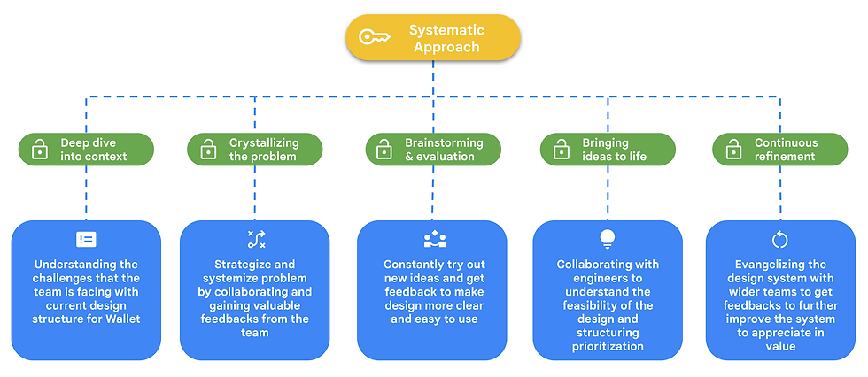
Systematic approach to solving complex problems
Beginning of the Wallet design system
-
Create a single source of truth documenting everything about Google Wallet for all xfn team (PM, UX and Engineering).
D.R.Y (Do Not Repeat Yourself) Documentation
I structured the foundational principle of the Design System called DRY documentation.
Do Not Repeat Yourself documentation.
A design system that ensures that every documentation is meticulously defined and documented once and only once.
This includes components, views, flows, and everything about Wallet.
Creating design system with single source of truth.
.png)
Building internal tools for clear communication
Wallet Annotation System is important part of the system to make DRY system work.
This part of the design system is essential in keeping design and implementation consistent.
The Annotation System includes unique cover card which instantly relays page status.
Helping to understand progress of the design, boosting team communication and workflow.
And Note card component acts as a navigational element guiding anyone using the system to a single source of truth

Strategy in responsive components
2. Strategy in building a robust and responsive component design library through collaboration and proactive understanding of the product.
Launching Wallet in Google Pixel Fold
.png)
Building the responsive component in the Wallet Design System was to tackle a project, extending Google Wallet to support new form factors like foldable for the Google Pixel Fold launch at the 2023 Google I/O.
Challenges to designing for foldables
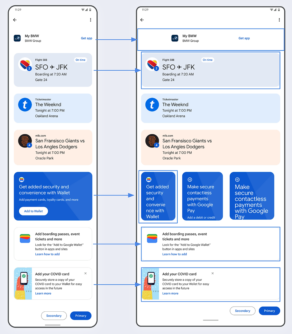
The biggest challenge I encountered during the foldable device launch was discovering that many core components built simply weren't responsive or flexible enough to adapt to different display form factors.
This raised a red flag for me because it could seriously compromise the user experience on foldable devices.

Building the Google Wallet Design System

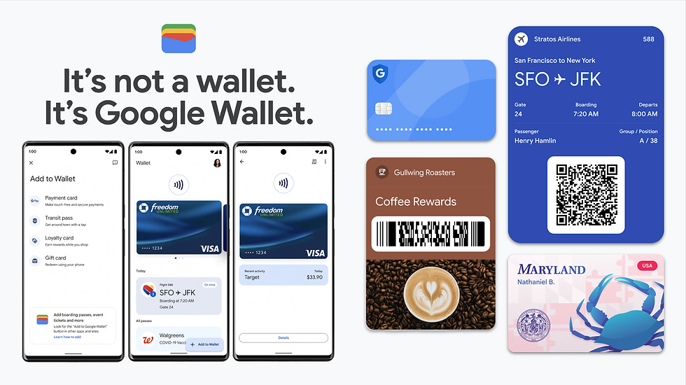
What is Google Wallet?
Google Wallet is a digital wallet platform providing payment structure, boarding pass, driver license, transit card and more to help user ditch the physical wallet for good.
Single design file containing...
Building unified Wallet design system includes these 3 points
1. Create a single source of truth documenting everything about Google Wallet for all xfn team.
2. Strategy in building a robust and responsive component design library through collaboration and proactive understanding of the product.
3. Establish a space for communication and increasing collaborate effort with engineer to build reusable Wallet UI code library.
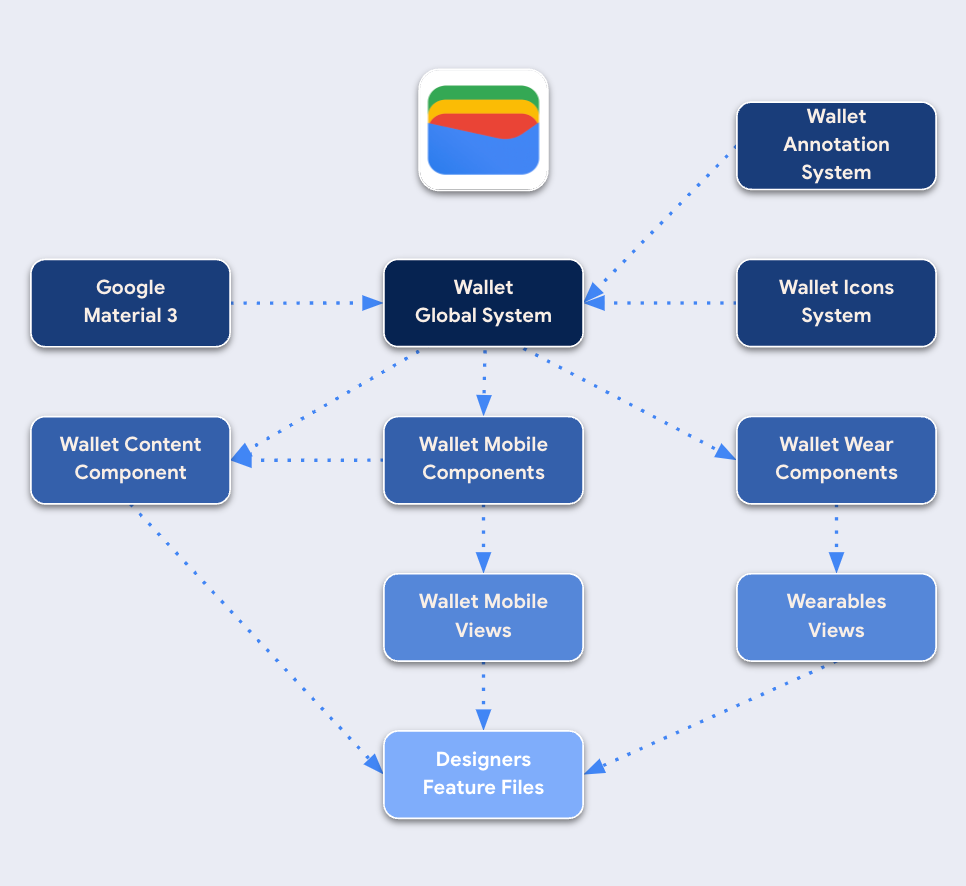
Creating structure and organization
In order to make DRY documentation work I had to organize design system to address inefficiencies of the single MVP file, by developing an inter-connected hierarchy design system.
Centralized Hub: Providing a central access point for all vertical designers.
Streamlined Collaboration: Helping designers to work efficiently.
Simplified Documentation: Creating a single source of truth for all documentation.
Empowering Designers: By providing design assets that designers and engineer feels confident in using.
Building internal tools for clear communication
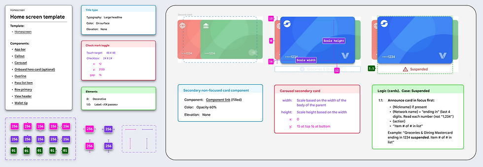
By designing and creating clear tools to document components and elements specs,
I've found myself and the team working much more efficiently for clear design hand offs.
This communicates, styling, measurements, and most importantly, accessibility greenlines.
This ensures everyone on the team, from designers to developers, to always design and build with inclusivity in mind.
Accessibility focused system

With strong focus on accessibility documentation I even documented at the smallest element in the system which are the icons.
I integrated accessibility documentation directly into each icon's properties panel. This created consistency across icon library and boost efficiency for both designers and developers.
By building system with accessibility as a focus, the design system follows the single source of truth.
Crafting adaptive design systems
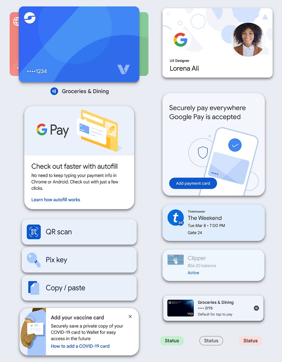
And simply building a responsive component was the easy part.
But strategizing and structuring a component that evolve to future needs was most challenging part in building the components.
I believe in design systems that don't just look good, but they evolve.
Tailored Components: To new surface experience.
Cohesive Harmony: Unifying the visual language.
Future-Proof Foundation: by building the component so that it is flexible to future updates.
This resulted in a living breathing ecosystem of design that elevates usability.
The power of component management

Early on, I noticed that we had multiple usability variations for the same component.
This made it difficult to manage and update the designs within system efficiently.
Therefore, I took the initiative to create a single, adaptable master template component.
This approach not only saved valuable time and resources, but also ensured seamless updates for both designers and engineers.
Building a universal component

.png)
To achieve single template component build requires massive collaboration with all the vertical team and their eng partners.
And also deep understanding of the product.
I shared design codebase across different teams, conducted workshops and discussions to ensure engineers and designers understood the component's construction and functionalities.
By taking this collaborative approach, I designed powerful component that serve a wide range of use cases.
Meticulously built supporting components
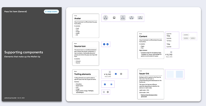
Creating reusable and adaptable components starts with a strong foundation of supporting components.
This approach might seem like extra work upfront, but it allows me to easily support any future update feature that needs to be adopted.
Sometimes even the most simplest component takes a lot of planning, testing, and failing, that results in a design system component that truly lasts.
Building the system with engineers
3. Establish a space for communication and increasing collaborate effort with engineer to build reusable Wallet UI code library.
Engineer focused system
.png)
Systematic design goes beyond just a process.
It's an engineer-centric approach that fosters collaboration.
By focusing on clear communication and utilizing a language engineers understand.
Designing solutions that are not only accessible to designers but also maintainable and understandable for the engineers who bring design to life.
Importance of nested properties
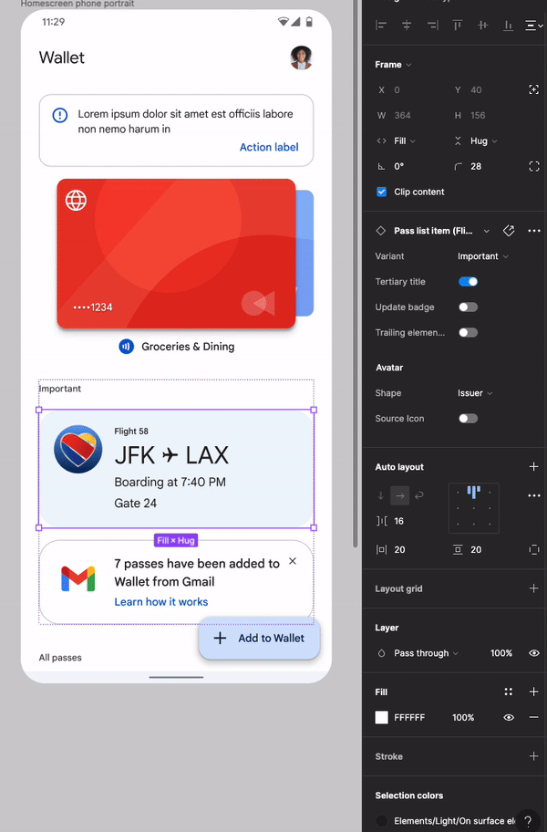
And through careful naming and well-structured subcomponents, I've been able to achieve two things.
Capturing a wide range of functionalities within a single component but most importantly I created a component that is complex to build but easy to use
I constantly help to teach the team how to best build the system.
All the wallet team designers are now all invested into the system experience.
Bridging the gap between design and engineering
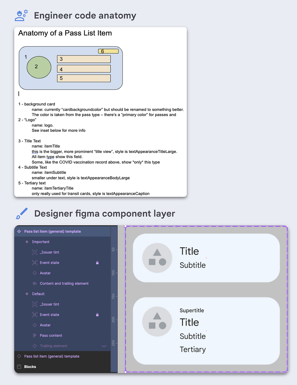
When I was building the Wallet Component library, my eng partner was building the Wallet reusable UI code library in parallel.
And from day one, I gained valuable insights into the needs of the engineer and their perspectives on every element in the system.
This collaborative approach built Figma design system that is 1:1 in parity with Engineers Code library.
And since designers and engineers to speak the same language. It created faster iteration and smoother handoffs.
Resulting Wallet to be a higher quality designed product that are both beautiful and functional.
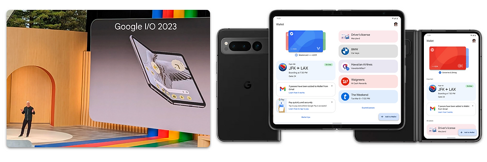
Ready to be unfolded for the foldables
Now in May 2023 Google I/O announced new Pixel Fold mobile device.
And with systemized design system, comprehensive accessibility, robust components and a well-defined view level system,
the Wallet was ready to be unfolded for the foldable device.
The impact of Wallet design system
And now after launching Wallet for foldables and structured design system in place, I continue to bring impact with Wallet design system.
Driving design system excellence & velocity

I've leveraged my system expertise to create a ripple effect of positive change across multiple teams.
By evangelizing the benefit of Wallet’s design system and collaborating with designers and developers.
I helped onboard and share knowledge with Wallet Web, RTP, and Wallet Wear, to have smooth and well structured system experience. .
From redundancy to efficiency

At the view level with my previous experience on foldable devices at Samsung,
I was able to help designers and engineers to find the most efficient ways to design on foldable device.
And with developed DRY Documentation system in place centralizing all component specs in a dedicated file.
View template specs became more focused on their primary purpose.
Boosting efficiency for both designers and developers.
We can all spend less time searching for documentation and more time creating amazing product as a team.
The Wallet design system is …
Not a static project but an ever-evolving product and service that demands ongoing management and refinement.
Design system will always grow!
Now the Wallet Design System is built to scale.
Started with 1 component to 91 component.
With over 290 thousand component instance inserts in the past 3 months.
And proud 0.3% instance detachment from the Wallet Design System components.
Establishing a solid foundation of reusable components.

Built to scale
As the lead designer of the Wallet design system…
I've come to realize that the system's growth is linked to my own growth as a designer.
Systematic thinking design and proactive management are essential to ensure the system’s continued success.
I continued to share my knowledge and evangelize the system experience.
Onboarding17 design leads and with their eng partners.
Currently 75 teams have used the Wallet Design System.
Including vertical teams and anyone in Google using any elements from the Wallet DS
Now, 20% of the payment platform makes up of the system’s total usage.
And with Wallet Web and RTP integrating into the design system that percentage is destined to grow.


